
A column for 2/3 Strongbow variants
Mandatories:
• Must maintain brand look + feel + colours. Should shout Strongbow
• Ability to serve any 2/3 brands (perhaps via interchangeable lens)
• Must deliver strong noticeability
• Sides must light up
• Front archer also should light up
• Premium handle
• Easy installation
Considerations:
- Utilize arrow equity. Play off of the arrows shape/curvature
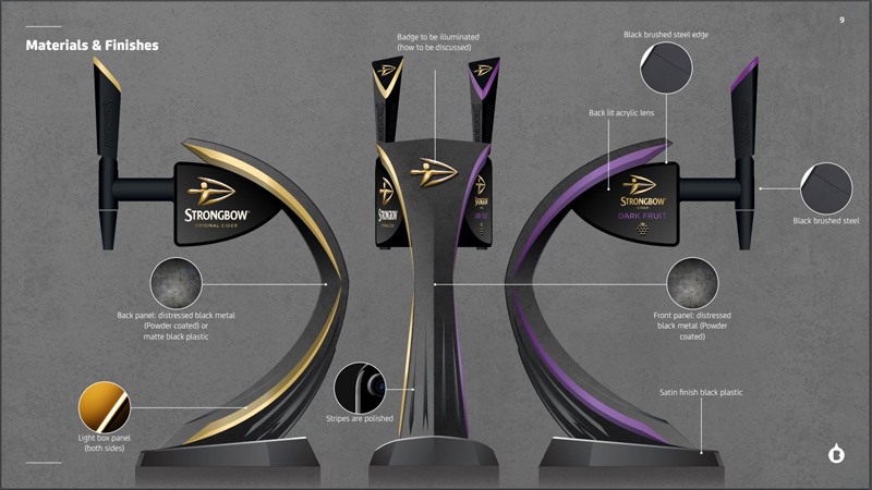
The Strongbow Dual font is the most architectural challenging column that Heineken UK have on the market to date. The eye-catching Bow shape was the main design focus, which also pushed casting capabilities to another level. The various sections of the Tower are made from a mixture of materials to achieve the desired overall finish, stability and quality. Interchangeable side panels were designed to ensure Branding could be changed between Strongbow Ciders with ease. The unit boasts 96 LED bulbs making it near impossible to miss on a bar top. Every inch of this unit has been designed down to the last detail. The finish of the unit was colour matched from a sample given for Heineken.
The engineering behind this masterpiece is truly incredible, all components can be changed and replaced on site. This removes the need to disconnect, return to warehouse to change parts and re-install, which reduces service cost massively.
At a time when competition for space on the bar is increasing, the Dual font is perfect to bring the Strongbow Ciders together, taking up the same bar space as a single dispense unit. Recent research has shown that pubs and bars stocking Strongbow Original and Strongbow Dark Fruit alongside each other, will experience a rate of sale increase of a staggering 44%


